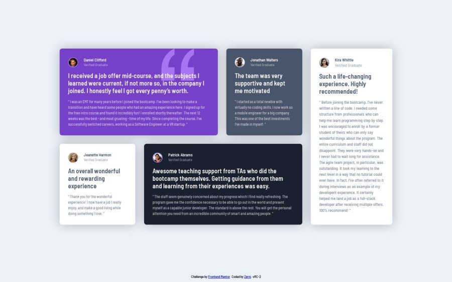
Design comparison
Community feedback
- @MelvinAguilarPosted about 2 years ago
Hi there 👋. Good job on completing the challenge ! I have some feedback for you if you want to improve your code.
HTML:
- You must use a level-one heading (h1) even though this is not a full-page challenge. You can create an '<h1>' element within your 'main' element that will be hidden visually but visible and readable by screen readers. The class "sr-only" hides content visually and here are the styles to copy. e.g.:
<h1 class="sr-only">Testimonials grid section</h1>
- The
<br>tag is not a semantic element. If a screen reader user is reading the page, they will hear "line break", which breaks the flow of the content. Instead, use CSS properties likemarginandpaddingto add vertical space between elements.
- To improve the semantics of your code you should use the
<figure>and<blockquote>tags to wrap the testimonials, with this, you will be able to encapsulate the author and the citation of the testimonial.
Example:
<figure>
	<blockquote>
		<p>"Example of a testimonial"</p>
	</blockquote>
	<figcaption>
		<p>Example of the author</p>
	</figcaption>
</figure>
You can read more about the
<figure>and<blockquote>tags with this two links:CSS:
- Instead of using pixels in font-size, use relative units like
emorrem. The font-size in absolute units like pixels does not scale with the user's browser settings. This can cause accessibility issues for users who have set their browser to use a larger font size. You can read more about this here.
- While it is acceptable to use flexbox in this challenge, it is preferable to use grid layout for this type of challenge.
I hope you find it useful! 😄 Above all, the solution you submitted is great!
Happy coding and Happy New Year! 🎉🎊🎁
Marked as helpful2@cartaplassaPosted about 2 years ago@MelvinAguilar thank you very much for your feedback, it's much appreciated, and happy NY to you too. About your suggestions:
-
Level-one heading: Done. I've read the post regarding the issue of screen readers: setting an element's
visibility: hiddenproperty wouldn't fix the issue, is that correct? Right now I've set the h1's size to 1x1 so it should be invisible on screens, but screen readers should still see it. How can I test my page for SR compatibility? -
Line break element: I got rid of it. I've had a hard time tuning font sizes and paddings to look exactly like in sample screenshots, but I couldn't line them up correctly. Now, although text doesn't line up exactly as is it does in the original design, the total amount of lines does match (I think it is important from design perspective).
-
<figure>and<blockquote>: Help me understand this, should I put<figure>inside<section>tag? Also, right now author's name is an<h2>element. It helps with separating each testimonial's contents in text-only view. How can I achieve the same effect when it's replaced with<figcaption>? -
Relative units: Actually I've tried to make everything depend on viewport height, I've even left my own calculations in
style-guide.md, but there are two major problems with this approach. Firstly, the font size is specified in style-guide as being 13px, so I've had to set it as root element's default and every other element's font size is decided relative to it. And secondly, since font size is static, I've had to make the main container's dimensions the same way. Again, as far as I see it, all of text blocks' amount of lines are an integral part of the initial design (like first quotes should be exactly three lines, second quotes in elements 1 and 2 should be five lines and in 3 and 4 - four lines long). So I've measured the card size on the sample screenshots and built everything on these measurements. The only problem afaik is that on 4K displays the card will be too small. But the simple solution on user's side would be to adjust browser's zoom level.
0 - You must use a level-one heading (h1) even though this is not a full-page challenge. You can create an '<h1>' element within your 'main' element that will be hidden visually but visible and readable by screen readers. The class "sr-only" hides content visually and here are the styles to copy. e.g.:
Please log in to post a comment
Log in with GitHubJoin our Discord community
Join thousands of Frontend Mentor community members taking the challenges, sharing resources, helping each other, and chatting about all things front-end!
Join our Discord
