Submitted over 1 year agoA solution to the Testimonials grid section challenge
Testimonials grid section
@andiaz

Solution retrospective
What are you most proud of, and what would you do differently next time?
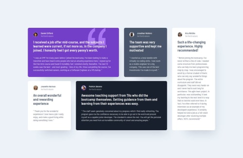
That I started implementing this challenge, using a mobile-first approach. It felt as if that made the whole challenge much easier to handle CSS-wise.
What challenges did you encounter, and how did you overcome them?The trickiest was finding a good way to get the testimonial cards span as intended over the given rows and columns. Once I found out about grid-template-areas then it was quite straightforward :)
What specific areas of your project would you like help with?Any feedback on best practices using CSS grid is most appreciated (and any other feedback of course!).
Code
Loading...
Please log in to post a comment
Log in with GitHubCommunity feedback
No feedback yet. Be the first to give feedback on andiaz's solution.
Join our Discord community
Join thousands of Frontend Mentor community members taking the challenges, sharing resources, helping each other, and chatting about all things front-end!
Join our Discord