Design comparison
SolutionDesign
Solution retrospective
Hi everyone!
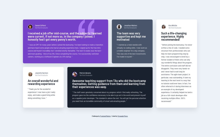
Whithout the figma file is way harder to get the exact size of the content but I did it as close as possible. It is responsive on mobiles, tablets and desktop devices. Does anyone know how I can add the box shadow to the center at the bottom of every card? I have no idea how to set it. 😓
What do you guys think? feel free to see my code, any feedback is welcome!
Community feedback
Please log in to post a comment
Log in with GitHubJoin our Discord community
Join thousands of Frontend Mentor community members taking the challenges, sharing resources, helping each other, and chatting about all things front-end!
Join our Discord
