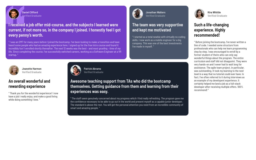
Design comparison
Solution retrospective
any feedback is welcomed
Community feedback
- @AdrianoEscarabotePosted almost 2 years ago
Hello Engjell Bakiasi, how are you? I truly loved your project's outcome, however I have some advice that I hope you'll find useful:
To align some content in the center of the screen, always prefer to use
display: flex;it will make the layout more responsive!body { margin: 0; padding: 0; display: flex; align-items: center; flex-direction: column; justify-content: center; min-height: 100vh; }You have used <br> , using <br> is not only bad practice, it is problematic for people who navigate with the aid of screen reading technology. Screen readers may announce the presence of the element. This can be a confusing and frustrating experience for the person using the screen reader. You can read more in MDN.
The remainder is excellent.
I hope it's useful. 👍
Marked as helpful0
Please log in to post a comment
Log in with GitHubJoin our Discord community
Join thousands of Frontend Mentor community members taking the challenges, sharing resources, helping each other, and chatting about all things front-end!
Join our Discord
