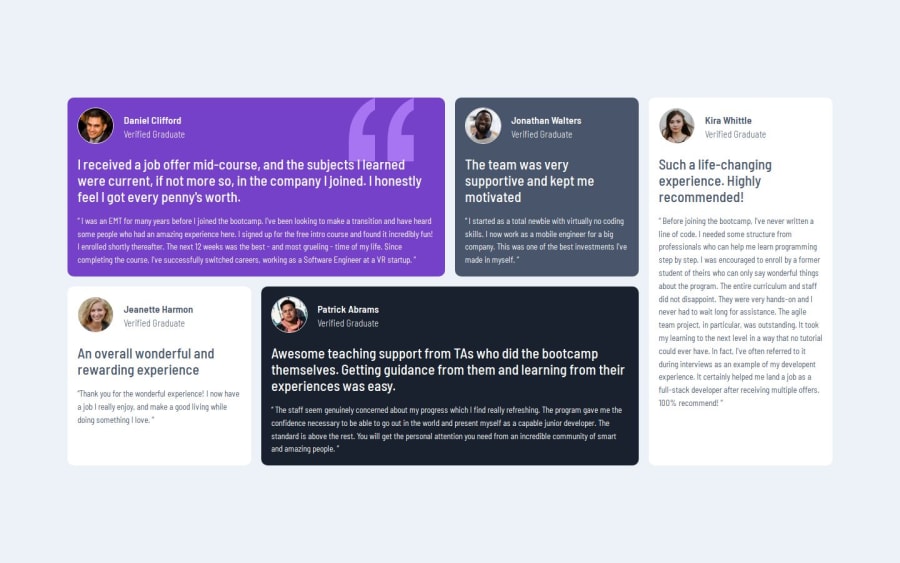
Testimonials Grid Section


Design comparison

Solution retrospective
Combining CSS Grid and CSS Flexbox to achieve desired results
What challenges did you encounter, and how did you overcome them?Ensuring the main container stays in the middle of the body regardless of what devices are being used to view the website.
I initially used margin: 0 auto but there was an issue using it, eventually, I was able to use display: flex with align-items and justify-content to be center
Community feedback
- @danielashjariPosted about 2 months ago
The only thing I'd add is the aria roles and labels to make it more accessible (https://developer.mozilla.org/en-US/docs/Web/Accessibility/ARIA) I'd also name the colors differently(based on what element will be that color) for example instead of
--very-dark-blue:fffff;
``` id do
--background: fffff; BTW, you nailed it
0@tuhamworldPosted about 2 months ago@danielashjari Thank you for the comments on using aria roles and labels.
As regards the naming colors, all the codes are actually named based on their color.
I gave
$whitethe actual color of white.I can't find the code you gave as an example in my code. Can you please share a screenshot?
1@danielashjariPosted about 2 months ago@tuhamworld i cant sen screen shots here. It's not that important, but you can check out codercoder's YouTube video about building a frontend mentor project, it'll help you
0

Please log in to post a comment
Log in with GitHub
Join our Discord community
Join thousands of Frontend Mentor community members taking the challenges, sharing resources, helping each other, and chatting about all things front-end!
Join our Discord