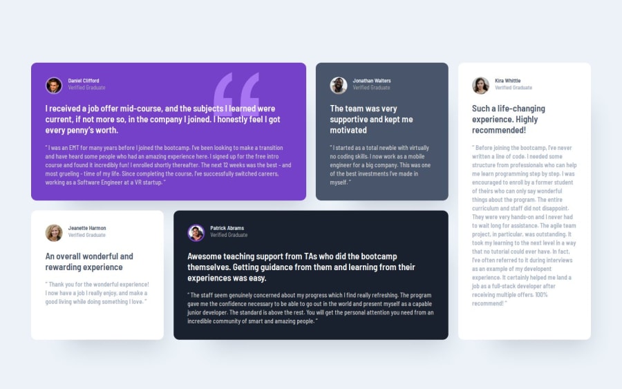
Design comparison
SolutionDesign
Solution retrospective
What specific areas of your project would you like help with?
Im not sure what Im doing wrong to make my screenshots look so bad, but I suspect it has something to do with the main container's positioning/centering, so any help with that would be most appreciated.
Community feedback
- @rough-diamond213Posted 8 months ago
you did a good job, thumbs up
0
Please log in to post a comment
Log in with GitHubJoin our Discord community
Join thousands of Frontend Mentor community members taking the challenges, sharing resources, helping each other, and chatting about all things front-end!
Join our Discord
