Design comparison
Solution retrospective
Are there any sections in the project that needs improvement? What are the best practices for working with css?
Community feedback
- @correlucasPosted about 2 years ago
👾Hello @hensco95, Congratulations on completing this challenge!
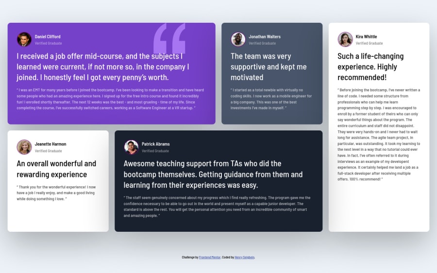
Your html is working but you can improve it using meaningful tags and replace the divs, for example the main div that takes all the content can be wrapped with
<main>or section, about the cards you can replace the<div>that wraps each card with<article>you can wrap the paragraph with the quote with the tag<blockquote>this way you'll wrap each block of element with the best tag in this situation. Note that<div>is only a block element without meaning, prefer to use it for small blocks of content.This article from Freecodecamp explains the main HTML semantic TAGS: https://www.freecodecamp.org/news/semantic-html5-elements/
The best way to do it is by using
flexbox. First step is to addmin-height: 100vhto make the body height size becomes 100% of the screen height, this way you make sure that whatever the situation the child element (the container) align the body and then use the flex properties for alignment withdisplay: flex/align-items: center;/justify-content: center;body { min-height: 100vh; font-family: 'Barlow Semi Condensed', sans-serif; background: var(--Light-grayish-blue); font-size: 13px; line-height: 1.6; display: flex; align-items: center; justify-content: center; }✌️ I hope this helps you and happy coding!
Marked as helpful0@hensco95Posted about 2 years ago@correlucas Thank you for your feedback. I'll implement it moving forward.
1
Please log in to post a comment
Log in with GitHubJoin our Discord community
Join thousands of Frontend Mentor community members taking the challenges, sharing resources, helping each other, and chatting about all things front-end!
Join our Discord
