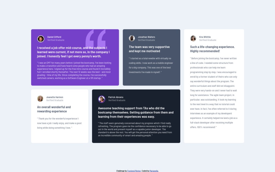
Design comparison
Solution retrospective
Hello!
Challenging challenge! I feel as though I am learning quite a lot, but always there are things I need to improve. Am I using the correct tags? Is there anything I need to keep in mind to simplify things? Does it look like I'm over thinking things (which I do)? Thank you!
Community feedback
- @Remy349Posted almost 2 years ago
I saw the final result of your project and it is amazing, love it. Just a little tip for you to improve when using tags in HTML. Note that you used a lot of <div> tags which in the end gave you the expected result but there are many more tags you can use, like <main>, <article>, <figure>, <figcaption>, <blockquote> tags. Personally I used the following structure:
<main>
  <figure>
    <div>
      <img />
      <figcaption>Text here!</figcaption>
    </div>
    <p>Text here!</p>
    <blockquote>
      " Text here! "
    </blockquote>
  </figure>
</main>
I leave you this link so you can learn a little more about these tags and apply this new knowledge to your future projects, keep learning about web development
Just one more thing, keep in mind the responsive design to make your projects adaptable to all devices, I recommend you to use the Mobile First design methodology.
And don't worry about overthinking things, it's okay to be curious and ask questions, it will clear your doubts and you will learn more :)
Marked as helpful0@Marianellag1Posted almost 2 years ago@Remy349 Hello! Thank you so much for the comment! I really appreciate it. I was looking at those that you mentioned. And I did think about them, but I didn't know they could be used in this challenge. I will use them to understand them more. Thank you again!!
0
Please log in to post a comment
Log in with GitHubJoin our Discord community
Join thousands of Frontend Mentor community members taking the challenges, sharing resources, helping each other, and chatting about all things front-end!
Join our Discord
