

Design comparison
SolutionDesign

Solution retrospective
What are you most proud of, and what would you do differently next time?
Happy with the responsive grid layout. Next time I would plan out my project tasks and execution steps.
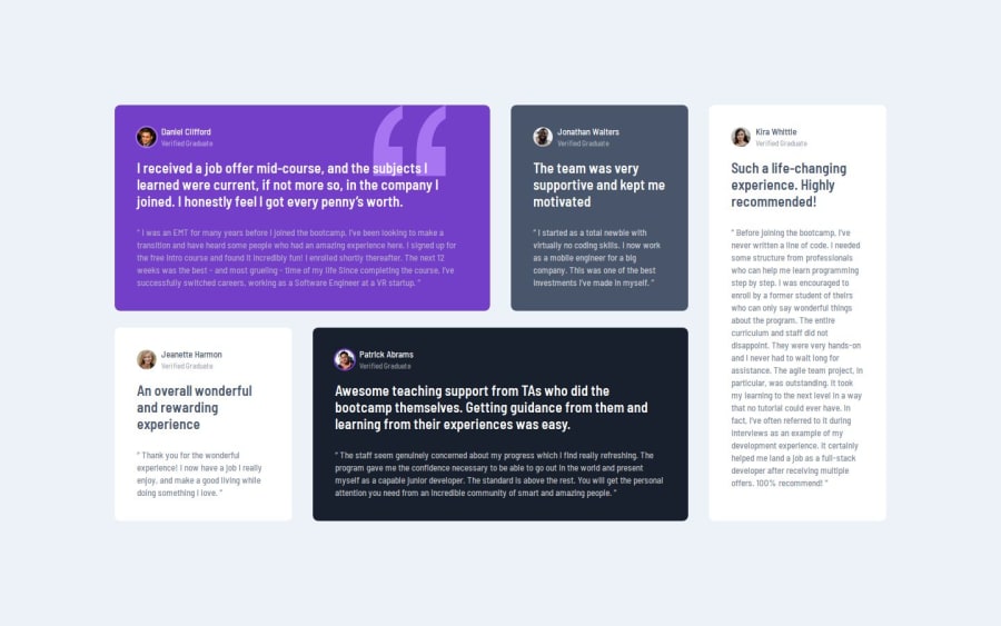
What challenges did you encounter, and how did you overcome them?The circle behind the profile images was a challenge. It isn't calculated as part of the document flow, so I had to use a pseudo-element to target it, and getting the size of the image-wrapper and image was tricky. Turns out I had to set the flex container to align-items center to stop the image-wrapper from stretching and distorting the pseudo-element.
What specific areas of your project would you like help with?None!
Community feedback
Please log in to post a comment
Log in with GitHubJoin our Discord community
Join thousands of Frontend Mentor community members taking the challenges, sharing resources, helping each other, and chatting about all things front-end!
Join our Discord