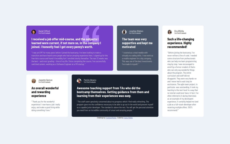
Design comparison
Solution retrospective
I am proud that, through these tutorials, I am slowly beginning to learn the CUBE CSS system. I tried to complete the task according to this methodology to the best of my understanding.
What challenges did you encounter, and how did you overcome them?A big challenge was getting to know the Grid layout. I watched some videos by Kevin Powell, who explains the grid in a very simple way.
What specific areas of your project would you like help with?I definitely have a lot of room for improvement in the CUBE methodology and the grid layout.
Community feedback
- @emmadumbiPosted 6 months ago
great job! I think you should not focus only on the provided device width in the challenge file, you can make yours responsive in different device widths. you can check out my solutions as well and let me know what you think.
0
Please log in to post a comment
Log in with GitHubJoin our Discord community
Join thousands of Frontend Mentor community members taking the challenges, sharing resources, helping each other, and chatting about all things front-end!
Join our Discord
