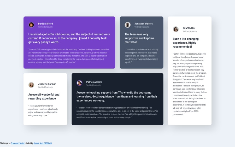
Testimonials Grid Component using SASS.
Design comparison
Solution retrospective
@include responsive(phone) { grid-template-columns: 1fr; grid-template-rows: repeat(auto-fit, minmax(0, max-content)); }
I learned from above partial code that this provides a single-column and enough number of rows with max height is max-content.
I am open for any kind of feedback :) Thanks for that.
Community feedback
- @correlucasPosted about 2 years ago
👾Hi Osman , congrats on completing this challenge!
Your html is working but you can improve it using meaningful tags and replace the divs, for example the main div that takes all the content can be wrapped with
<main>or section, about the cards you can replace the<div>that wraps each card with<article>you can wrap the paragraph with the quote with the tag<blockquote>this way you'll wrap each block of element with the best tag in this situation. Note that<div>is only a block element without meaning, prefer to use it for small blocks of content.This article from Freecodecamp explains the main HTML semantic TAGS: https://www.freecodecamp.org/news/semantic-html5-elements/
✌️ I hope this helps you and happy coding!
0@osmannurierdoganPosted about 2 years agoHi @correlucas,
I understand that I should use meaningful tags. I will update my solution then.
Thanks for your feedback :)
0 - @hyrongennikePosted about 2 years ago
Hi @osmannurierdogan,
Nice job on the completing the challenge
You can add the following media query at the bottom of your CSS file to make mobile look better.
@media (max-width: 768px) { .testimonial-list.grid > div { margin-bottom: 2rem; } .testimonial-list.grid { display: block; } }0@osmannurierdoganPosted about 2 years agoHi @hyrongennike,
I will update my solution. Thanks for your comment :)
0
Please log in to post a comment
Log in with GitHubJoin our Discord community
Join thousands of Frontend Mentor community members taking the challenges, sharing resources, helping each other, and chatting about all things front-end!
Join our Discord
