Design comparison
SolutionDesign
Please log in to post a comment
Log in with GitHubCommunity feedback
- @Stephanie-Dennehy
Hi,
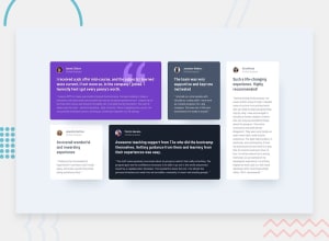
Nice job on this project. Your grid looks great. There are 2 things that I noticed when viewing the live site.
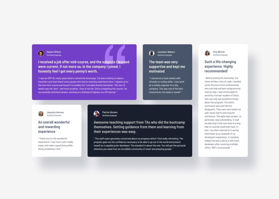
- The text on the white cards is very light and hard to read. You might want to check the contrast on these to see if the color combination is accessible.
- When looking at the mobile view, cards 3-5 are not the same width as cards 1 and 2.
Join our Discord community
Join thousands of Frontend Mentor community members taking the challenges, sharing resources, helping each other, and chatting about all things front-end!
Join our Discord
