

Design comparison

Solution retrospective
This one took me a while longer but I finished it and was able to get pretty close to the design. Re-learning and applying these concepts have been fun.
What challenges did you encounter, and how did you overcome them?This one was tough. From choosing the correct displays, positioning, text placement, it was all a challenge. The 21 day course that was suggested before this learning path has helped alot.
What specific areas of your project would you like help with?Specially on the media query I could not get any space on the bottom of the page without messing up the entire layout. If someone could help me with that, I would appreciate it.
Community feedback
- @nodegreecodePosted 3 months ago
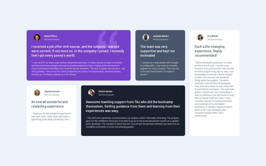
Hi, great solution overall! I particularly appreciated the clever trick of using an image for the double quotation mark instead of relying solely on font families and pseudo-elements. That approach could save a lot of time—something I personally spent quite a bit of effort on.
Your HTML is well-structured, and the styling is clean and effective. However, I’d suggest enhancing the layout a bit further by adding some spacing on the sides to improve the overall balance. Additionally, consider introducing a breakpoint in the middle of the responsive design. For example, you could switch to a two-column grid at that point, rather than jumping straight to a single-column layout.
Keep up the great work—your code is a pleasure to review.
Marked as helpful0P@ChefJTaylorPosted 3 months ago@nodegreecode Thank you so much! This was really good to read.
I'll keep the breakpoints in mind.
0

Please log in to post a comment
Log in with GitHubJoin our Discord community
Join thousands of Frontend Mentor community members taking the challenges, sharing resources, helping each other, and chatting about all things front-end!
Join our Discord