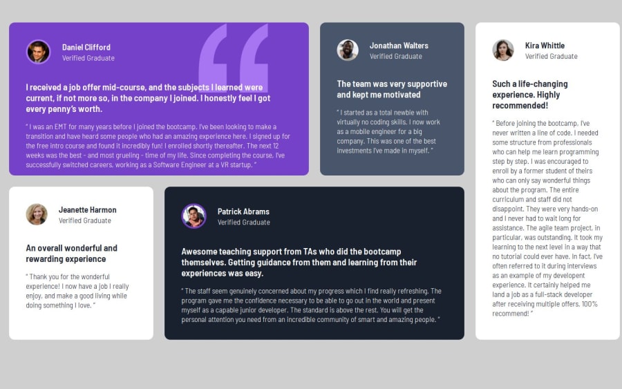
Design comparison
Solution retrospective
improving
What challenges did you encounter, and how did you overcome them?getting the quote img set up
What specific areas of your project would you like help with?Any advice is great.
Community feedback
- @pmcsilva90Posted 11 months ago
Hi Chris!
Your solution is looking alright. I do have a few suggestions, though:
-
When settin the font size, it's preferable to use rem instead of px. This ensures that the font size responds to user browser preferences. The default browser font-size is 16px, you can it's rem size by calculating 13 / 16, which is 0.8125rem.
-
Instead of including the quote img in you html file, you can include it in your CSS file like this:
background-color: var(--Moderate-violet); background-image: url(images/bg-pattern-quotation.svg); background-repeat: no-repeat; background-position: 81.5% 0;- You can change the opacity of the text without modifying its 'color' property by using the 'opacity' property.
There are a few other details that may not be worth mentioning. Overall it's looking alright.
Keep up the good work!
0 -
Please log in to post a comment
Log in with GitHubJoin our Discord community
Join thousands of Frontend Mentor community members taking the challenges, sharing resources, helping each other, and chatting about all things front-end!
Join our Discord
