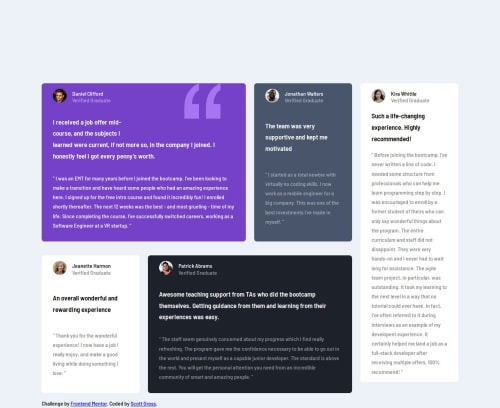
Testimonials-Grid

Solution retrospective
I'm most proud of my persistence in learning how to use Grid and Flexbox to create a responsive layout. Despite the challenges I faced in centering the content and positioning elements, I managed to get a decent result. Next time, I would focus more on mastering the intricacies of both layout systems so that I don't have to rely on hacks like using margin-top to center content. I would also spend more time fine-tuning the alignment of images and text to ensure they align perfectly across all devices.
What challenges did you encounter, and how did you overcome them?The biggest challenge was positioning the images and stacking the name and "Verified Graduate" text correctly. I spent a lot of time experimenting with different layout techniques in both Grid and Flexbox to get them to behave as I wanted. While I did manage to get the elements into place, I had to rely on less optimal methods like manually adjusting margins to center content. In the end, the layout worked, but it wasn't as elegant as I’d like it to be.
What specific areas of your project would you like help with?I would love to get help with fully understanding the grid and flex layout systems. Specifically, I'd like to know how to center content properly without using extra margins and how to make image and text alignment easier. Any tips on optimizing layouts for responsiveness without relying on excessive adjustments would also be helpful.
Please log in to post a comment
Log in with GitHubCommunity feedback
No feedback yet. Be the first to give feedback on Lord-Zethes's solution.
Join our Discord community
Join thousands of Frontend Mentor community members taking the challenges, sharing resources, helping each other, and chatting about all things front-end!
Join our Discord