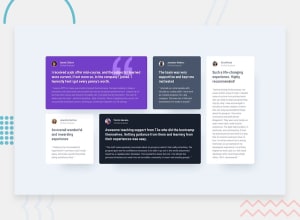
Design comparison
Solution retrospective
This was to test my Grid skills and I also learnt to figure / figcaption properly. As always, please feel free to give feedback should there be any.
Thank you!
Community feedback
- @bbsmoothdevPosted 11 months ago
Great job. This looks just like the original. Just a few recommendations for you to consider.
-
You didn't use any headings. I definitely think there are headings on this page. Where do you think they are? Headings are very important for people who can't see your page and are using a screen reader to listen to your page.
-
The responsiveness is almost perfect but has some issues at the edges. One test you should always do is to set your browser width to
1280pxand height to1024pxand then zoom in400%. At that zoom level you should be able to read all the content on the page without having to horizontal scroll. As you will see, there is a slight horizontal scroll at400%. The alternative is to use the dev tools responsive design mode to shrink the view port down to320pxwidth by256pxheight with normal100%zoom. This will give you the same proportions as the400%method. -
I will add that the design is using inaccessible color combinations, such as the light gray text on purple. I'm not going to knock you for that since you are just following the design specs. But in the real world you would need to make the text darker so that it meets minimum contrast ratio requirements.
Marked as helpful1@EuphoriaCXIPosted 11 months ago@bbsmoothdev
Thank you Bruce, I will keep your feedback in mind for my next project.
0 -
Please log in to post a comment
Log in with GitHubJoin our Discord community
Join thousands of Frontend Mentor community members taking the challenges, sharing resources, helping each other, and chatting about all things front-end!
Join our Discord
