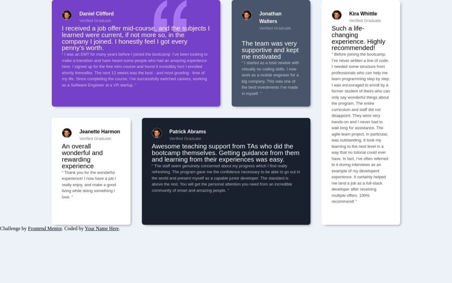
Design comparison
Community feedback
- @Psargar616Posted about 1 year ago
Hey @SaintSin! Impressive Work on the Testimonials Grid Section Challenge! 🌟
I wanted to reach out and express how impressed I am with your solution for the challenge. Your code structure is clean and well-organized, and getting the card pixel perfect is no small feat - great job! and I love that you used Astro.js—it's a fantastic choice!
I do have a few friendly suggestions that might enhance your project even further:
- Responsiveness: Ensure your design looks great on various devices and screen sizes. Consider using media queries to adapt your layout for mobile and tablet users.
- Sticky Footer: Try using
position: fixedormin-height: 100vhto keep your footer at the bottom of the webpage. It provides a polished finish to your site. - Fixed Width for Grid Container: Adding a fixed width to your grid container can provide stability to your layout, especially when viewed on larger screens.
Remember, these suggestions are just meant to help you grow even further. Your dedication to improvement is inspiring, and I'm confident you'll continue to excel. If you have any questions or need assistance with any of these suggestions, feel free to reach out. Keep up the great work, and I'm excited to see your progress! If you found this feedback useful, please mark this comment as helpful
0
Please log in to post a comment
Log in with GitHubJoin our Discord community
Join thousands of Frontend Mentor community members taking the challenges, sharing resources, helping each other, and chatting about all things front-end!
Join our Discord
