Design comparison
Solution retrospective
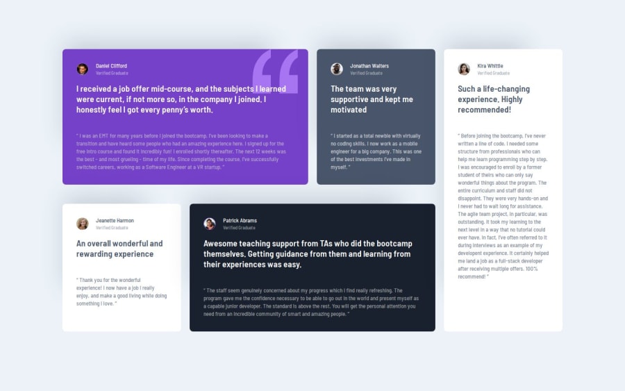
I am proud of the use of grid area, which makes the layout responsive and looks great.
Next time when designing a grid I will start with grid area, which makes the layout faster
What challenges did you encounter, and how did you overcome them?I had a problem with the grid but after reading a few guides I discovered the grid area feature which makes the cards look even and nice
What specific areas of your project would you like help with?I'm asking for general advice on design, code readability, and responsiveness.
Community feedback
- @brukmgPosted 6 months ago
Hey, awesome job on using CSS variables! 🎉 It's great to see you applying them so well it makes your code cleaner and more maintainable. Keep up the good work, you're definitely getting the hang of this! Just a few small tweaks here and there, and you'll be on your way to writing even more efficient code. Well done!
- Starting with the folder structure, it would be better to place
styles.cssin its own folder. - Focusing on semantic elements like
mainandfooterimproves your site’s readability, accessibility, and SEO-friendliness. - It's not necessary select elements
picture,video,canvas,svg,input,button,textarea,select,h2,h3,h4,h5andh6there are no such elements. - Only one media query is implemented. What about the other screen sizes?
Marked as helpful0 - Starting with the folder structure, it would be better to place
Please log in to post a comment
Log in with GitHubJoin our Discord community
Join thousands of Frontend Mentor community members taking the challenges, sharing resources, helping each other, and chatting about all things front-end!
Join our Discord
