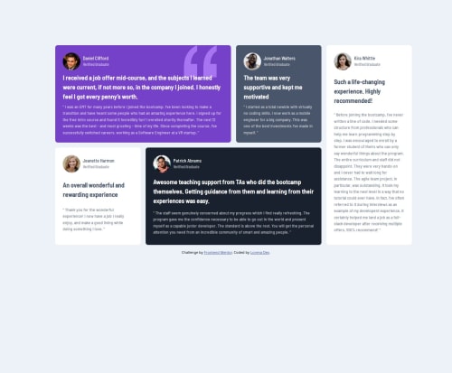
Submitted over 1 year agoA solution to the Testimonials grid section challenge
Testimonials grid
@cas1092

Solution retrospective
What are you most proud of, and what would you do differently next time?
i 'm really proud of the fact that i knew the elements on the html as soon as i saw he challenge, i previously had some issues with that. i also believe that my .css file it's cleaner that other solutions
What challenges did you encounter, and how did you overcome them?The main challenge was on the design, maybe with the figma file i could make this easy. Other thing is the fact that changing sizes made some cards overflow, i looked up the solution online
What specific areas of your project would you like help with?overflow, i rescue some solutiones online, but i think there is more to it.
Code
Loading...
Please log in to post a comment
Log in with GitHubCommunity feedback
No feedback yet. Be the first to give feedback on Lorena Castillo Goche's solution.
Join our Discord community
Join thousands of Frontend Mentor community members taking the challenges, sharing resources, helping each other, and chatting about all things front-end!
Join our Discord