Testimonials Grid

Solution retrospective
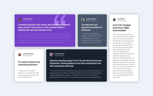
I usually do the mobile design first, but I did the desktop design first this time because it was more complex. The mobile mostly fell into place with ease by simply changing from grid to flexbox.
What challenges did you encounter, and how did you overcome them?I was lost on how to create the grid layout so I used an online grid generator to get the layout how it is on the site. While I did copy the code from the generator I do now understand how it works and I could do something similar again without it now.
What specific areas of your project would you like help with?When I set the height of the grid container it completely shifts the entire container down making it off-center. Not sure why it is doing this.
Please log in to post a comment
Log in with GitHubCommunity feedback
No feedback yet. Be the first to give feedback on matt2282's solution.
Join our Discord community
Join thousands of Frontend Mentor community members taking the challenges, sharing resources, helping each other, and chatting about all things front-end!
Join our Discord