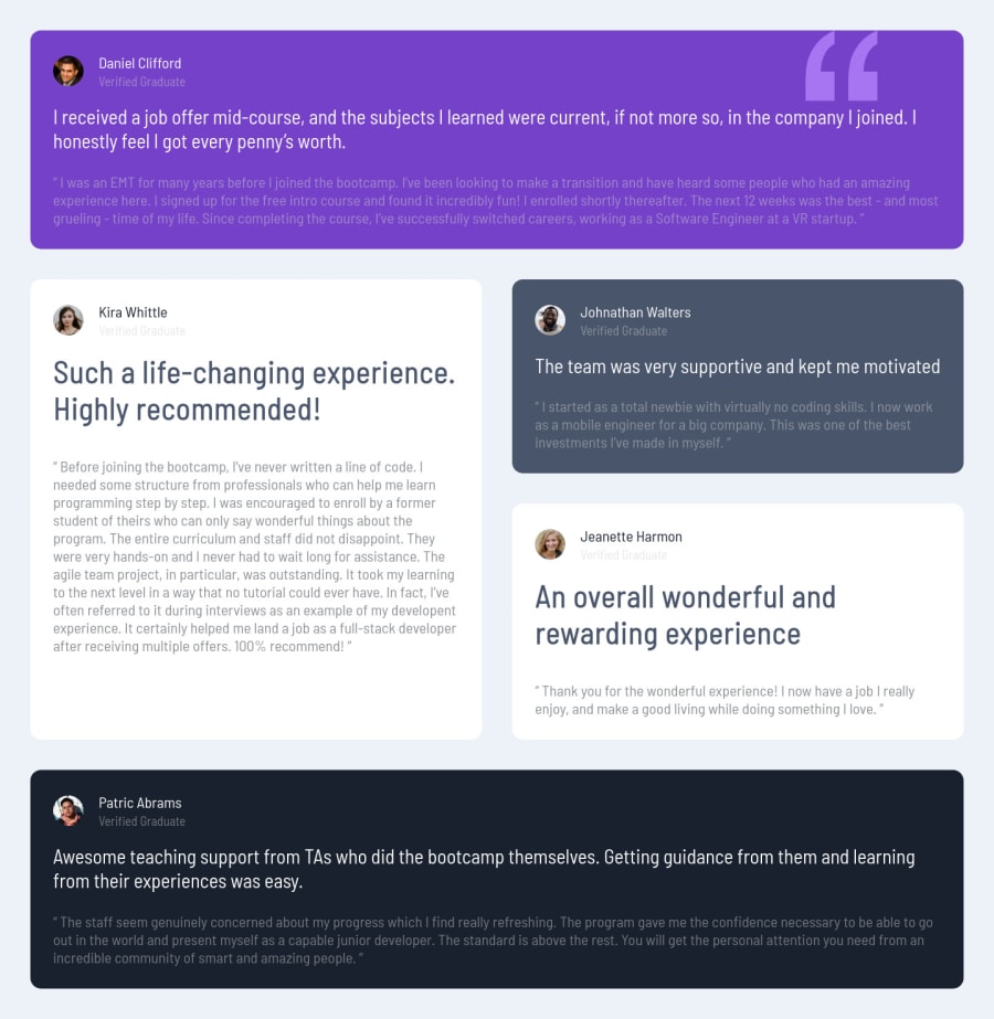
Design comparison
Solution retrospective
I found borders on icons to look weird so I passed on them, baside that I tried to replicate the rest of the site, hoping for some advices !
Community feedback
- @pikapikamartPosted about 3 years ago
Hey, great job on this one again. Though I had to zoom out in desktop to view the desktop layout since you are using 1470px as the desktop breakpoint which is too big for lots of users including me who uses 1366x768 resolution. Toning it down would be really great. Resizing, the layout adapts well and the mobile view looks really great as well.
Again, some suggestions would be:
- Only have a single
h1on a site. It would be great to change those headings into something likeh2. - Since there are not visible text that are suitable to be
h1, theh1would be a screen-reader only heading. Meaning it will be hidden visually but present for screen-reader users. On this, theh1would have likesr-onlyclass and the text-content should describe what is the main-content is all about. Theh1could be placed as the first text inside themain. Have a look at Grace's solution on this one. Inspect the layout and see the usage ofh1as well the stylings applied on it. - Also, for each testimonial card, you could use this markup:
<figure>
  <img src="" alt={person name}>
  <blockquote>
    <p> </p>
    <p> </p>
  </blockquote>
  <figcaption>
    person name
    <p>
      person role
    </p>
  </figcaption>
</figure>
Though you would need to use
display: gridon thefigureand place each of the item in their position like on the design. But this extra work is worth it since it will make the site more accessible.- When using
imgtag, you don't need to add words that relates to "graphic" such as "icon" and others, sinceimgis already an image so no need to describe it as one. - Also, those highlighted text in each of the testimonial aren't really heading tags. They are just like opening of the testimonial so it would be great to use
ptag on them. Because a heading tags must give information on what the section would contain and those text doesn't really give those. - Lastly, just adjusting the breakpoint.
Again, great job on this one.
Marked as helpful0 - Only have a single
- @Vueko1Posted about 3 years ago
EDIT : I also made additional breakdown so things don't look stretched/cramped
0
Please log in to post a comment
Log in with GitHubJoin our Discord community
Join thousands of Frontend Mentor community members taking the challenges, sharing resources, helping each other, and chatting about all things front-end!
Join our Discord
