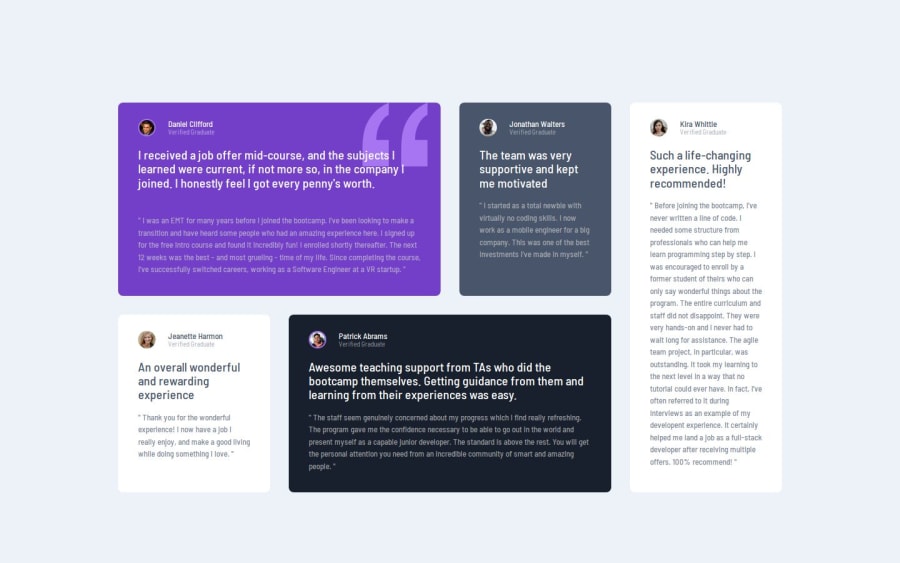
Design comparison
Solution retrospective
My use of CSS grid in order to create the design layout, easily switching between mobile and desktop.
What challenges did you encounter, and how did you overcome them?Wasn't sure initially how to best structure the HTML, but I think it looks good.
What specific areas of your project would you like help with?The responsive nature of my design and the use of CSS grid.
Community feedback
- @indigorosePosted 6 months ago
This a really good solution to the design brief.
Even though you mention that you had some difficulty with the HTML structure, your code is clean with helpful comments making it easy to read and understand your design process.
Maybe in future revisions of the challenge it may provide medium sized designs to help with the transition from smaller to larger desktop screen sizes.
Look forward to seeing your other solutions from this site.
Marked as helpful0 - @Roman-oryolPosted 6 months ago
I liked the solution. The layout implementation is good. The only thing missing is a hidden page heading for screen reader accessibility and headings for the review sections
0P@marcus-hillPosted 6 months agoHi @Roman-oryol thanks for reviewing my solution. After a bit of research on accessibility, I have added a new visually-hidden class and added a
<h1>to the top of the page (hidden only for screenreaders) and a<h2>for each review, showing it is a review by X person.This has definitely been a helpful insight into accessibility which I will work to add in all future projects. Thank you.
1
Please log in to post a comment
Log in with GitHubJoin our Discord community
Join thousands of Frontend Mentor community members taking the challenges, sharing resources, helping each other, and chatting about all things front-end!
Join our Discord
