Design comparison
SolutionDesign
Community feedback
- P@EfthymiosKPosted 6 months ago
Hi,
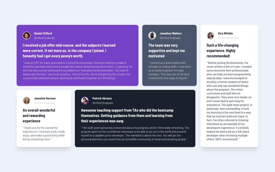
- You haven't created a mobile version of the site!
- The dimensions of the elements are not accurate but this is understandable since you don't have the Figma design.
- On the top left testimonial the border of the image should be purple.
- You haven't included the background image. Other than the above, it was a good try! Keep up the good work!
Marked as helpful1
Please log in to post a comment
Log in with GitHubJoin our Discord community
Join thousands of Frontend Mentor community members taking the challenges, sharing resources, helping each other, and chatting about all things front-end!
Join our Discord
