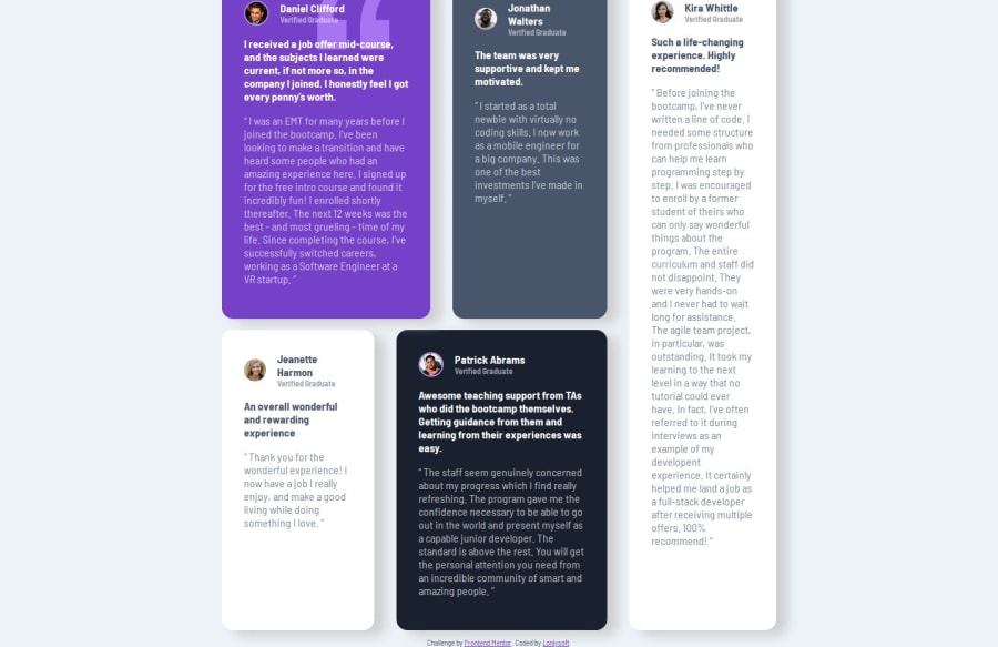
Design comparison
Solution retrospective
Now I decided to go for a desktop-first approach. And I also changed IDEs so now I don't need to go for inline SVGs. It was also my first time putting the CSS grid to work. It was pretty easy to do it with the grid-area and even made it quite responsive in desktop mode. I think I will use it more often when I decide to go for a design that It's needed to nest a lot with flexbox.
What challenges did you encounter, and how did you overcome them?The quotation SVG is something that I struggled with. At first I thought that it was an position: absolute stuff. Because it overlaps the text. I did it, but it looked off and made the text ""blurry"". Then I tried dividing the content in HTML to use z-index, but no matter how I tried the SVG refused to go to behind the text. So then I remembered the background-image property. That makes an image be behind text by default. After that, I used it and it was just a matter of setting values of position and no-repeat to get the design right.
Community feedback
Please log in to post a comment
Log in with GitHubJoin our Discord community
Join thousands of Frontend Mentor community members taking the challenges, sharing resources, helping each other, and chatting about all things front-end!
Join our Discord
