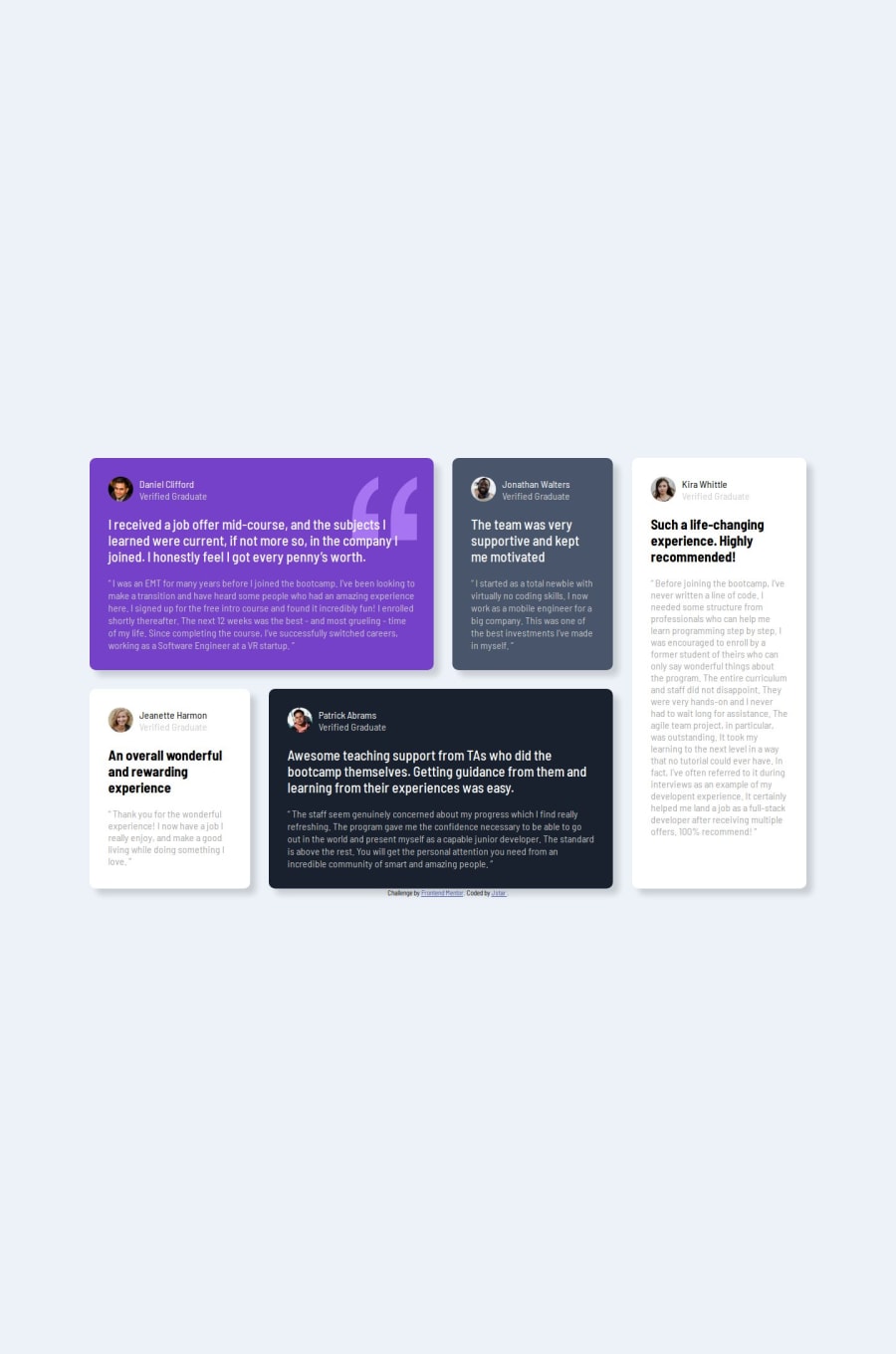
Design comparison
Community feedback
- @luccyyy97Posted 12 months ago
i think media query's breakpoint could be better. Just before things get ugly, grid position can be changed already. And try to use <p>, <h1> and etc.. for better accessibility instead of using div for everything. And also a lot of redundant code. For example, i think there is no need to set font-size to 16px since browser's default-size is already at 16px. And you are just going to override the person's browser setting which is bad because if a person maybe have difficulties in seeing small font, and they are setting their browser's to become big then you reset it again to become small. And also can try to learn use other unit (em, rem and etc...) for font-size for more responsiveness. Overall, not bad but could be more better. Keep going!!
0@Jstar7890Posted 11 months ago@luccyyy97 Thank you, So much I will make sure to use all this.
0
Please log in to post a comment
Log in with GitHubJoin our Discord community
Join thousands of Frontend Mentor community members taking the challenges, sharing resources, helping each other, and chatting about all things front-end!
Join our Discord
