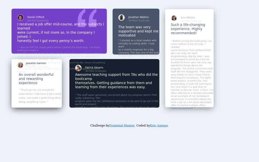
Design comparison
SolutionDesign
Solution retrospective
What are you most proud of, and what would you do differently next time?
I did this project two years ago, and I would say after looking over my code that I approached, I did well in understanding how to implement a CSS grid with the challenge.
What challenges did you encounter, and how did you overcome them?I vividly remember having to overcome getting the right font size correctly back when I did this challenge and setting the grid right back then.
What specific areas of your project would you like help with?Feel free for anyone around to give feedback on the design and how it came out on multiple devices and browsers.
Community feedback
Please log in to post a comment
Log in with GitHubJoin our Discord community
Join thousands of Frontend Mentor community members taking the challenges, sharing resources, helping each other, and chatting about all things front-end!
Join our Discord
