Testimonial Slider Mobile-first workflow
Design comparison
Solution retrospective
Hello! I'm very appreciated you spending time taking a look at my solution and give me feedback on some issues that I am having.
-
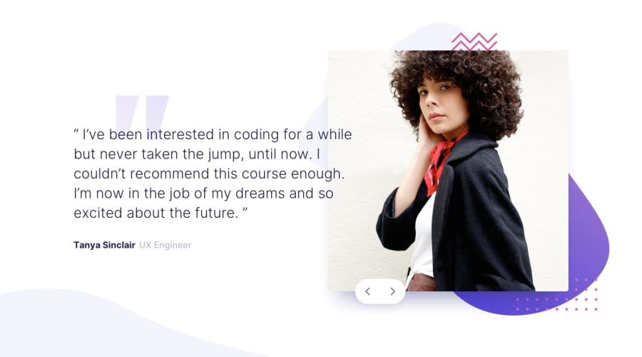
I have a slightly issue with the site in desktop view. How can I position the buttons and the background-image of the <div class='testimonial--container'> which is the quote pattern. They are now moving whenever I make the browser bigger. I also took a look at the site with my Samsung A51 (360px x 625px), it looks pretty nice. However the site looks off on my Samsung tablet (especially on portrait view). The buttons shift way almost to the top of the image's container.
-
Is it a good practice to use different units on css codes. I use both rem and px.
I'm open to all kind of feedback so I can improve in the next challenges. Thank you!
Community feedback
Please log in to post a comment
Log in with GitHubJoin our Discord community
Join thousands of Frontend Mentor community members taking the challenges, sharing resources, helping each other, and chatting about all things front-end!
Join our Discord
