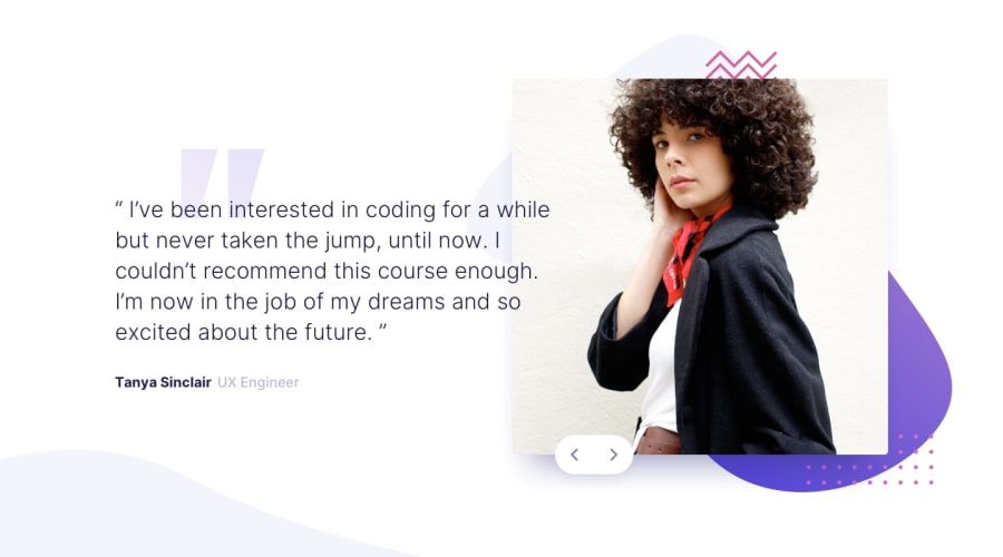
Design comparison
SolutionDesign
Solution retrospective
Any suggestions on improving the code ?
Community feedback
- @chrisbailey85Posted almost 4 years ago
Well done it looks good. The only thing is the arrows on you buttons looks a little out of place as there off centre. I had a little fiddle and you can fix it by, giving your .icons a display: flex; and then on the buttons a display flex, justify-content: center; and align-items: center;
1@neophyte1001Posted almost 4 years ago@chrisbailey85 Thankyou, I made changes now its looking good.
1
Please log in to post a comment
Log in with GitHubJoin our Discord community
Join thousands of Frontend Mentor community members taking the challenges, sharing resources, helping each other, and chatting about all things front-end!
Join our Discord
