

Design comparison

Solution retrospective
- Creating project that very closely resembles the design.
- Writing readable code.
- Improvement in understanding both CSS Grid and Flexbox.
- Understanding CSS position.
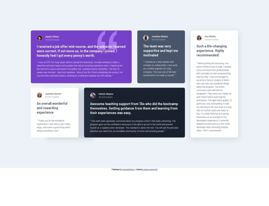
Positioning of quotation image (.card__img--position).
-
I tried to use min() also, min() and calc() together, so I could avoid using media-queries, that did not workout.
-
Finally, I used rem unit(position: top) and vw unit(position: left) alongwith media-query to position it as per the design on both small and large screen-size. [I feel, vw unit for vertical positioning worked smoothly compared to rem unit.]
I'm still very confused on how to use h1, when the project is either a section or just a card.
- As per my understanding, and from previous feedback: h1 should be used as a main-heading of the whole page.
I usually write under and hide it, is this a right practice?
- I got a new suggestion to change my tags to in the previous project. [Previous project code: https://github.com/cookie-monster01/four-card].
Could someone please guide me on this?
Also, please let me know how I could improve my solution. Thank you.

Join our Discord community
Join thousands of Frontend Mentor community members taking the challenges, sharing resources, helping each other, and chatting about all things front-end!
Join our Discord