Testimonial section challenge, build with HTML,CSS,Sass


Design comparison

Solution retrospective
I liked the fact that I had to change the grid for different screen sizes. I also added another break point between tablet and desktop screen and adjusted the layout accordingly. Next time I will try to use sass. I am still learning but I think it will make things much easier and cleaner.
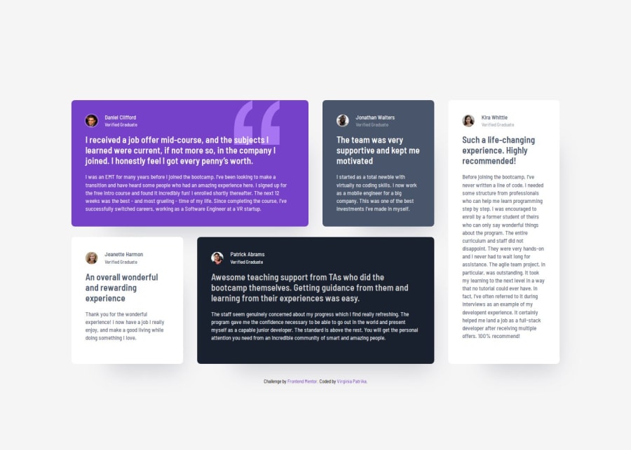
What challenges did you encounter, and how did you overcome them?Trying to keep the dimensions analogy as shown in the figma file especially while changing the grid layout. Using grid-template-columns: auto; solved it.
What specific areas of your project would you like help with?Please any feedback will be much appreciated.
Community feedback
- P@kaamiikPosted about 1 month ago
Hi. Some notes for your code:
- In each
.testimonial, The person name can be ah2tag as a heding.
- Also you have two blockquote. So you can structure like this:
And for your css you can add this too:<blockquote> <p>Bold text</p> <p>Regular text</p> </blockquote>blockquote > p.regular::before { content: "" "; } blockquote > p.regular::after { content: " ""; }
- Profile images do not need
alttext. You can set it toalt="". Avoid using words like image, picture, or photo in alt descriptions.
- For your CSS, There is lots of files and honestly It's really hard for me to find the problems. I think If you are using vanilla CSS It's better to wrap all of your code in one file or two file.
- Generally from your preview I can say you only need a
max-widthon your section tag. You do not needmin-width. And for your grid, You only need four columns and two rows and there is no need to define the rows height in your code. It's not true. Take this very simple and do not over complicate the code for your self.
Marked as helpful0P@VirginiaPatPosted about 1 month ago@kaamiik Thank you very much for your feedback! It was very helpful. I decided to rebuild the layout again using sass for the first time. I found the process faster and easier. It seems the outcome is closer to what it should be. If you have time to check it, I would love to hear you feedback.
0P@kaamiikPosted about 1 month ago@VirginiaPat It's much better now. Congratulation!
I think you can remove
min-widthand you don't need it. Also the::beforeand::afteris not working for adding the quote because you use thetestimonial__text__mediumclass instead oftext__medium.But overall you did a great job. I suggest now you watch the Kevin Powell that did this challenge in another way too. It really helps. https://www.youtube.com/watch?v=rg7Fvvl3taU
Marked as helpful0 - In each
- P@TonyzCataldoPosted about 1 month ago
Well, your design size is bigger than the request desktop design, outherwise your design is fine. keep coding.
0


Please log in to post a comment
Log in with GitHubJoin our Discord community
Join thousands of Frontend Mentor community members taking the challenges, sharing resources, helping each other, and chatting about all things front-end!
Join our Discord