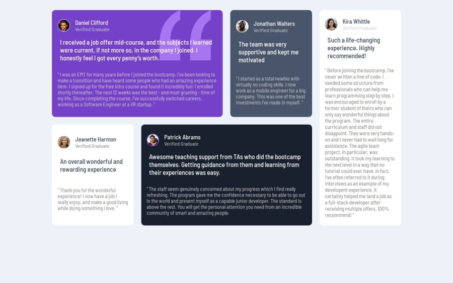


Design comparison

Solution retrospective
grid system and responsive started to be easy.
What challenges did you encounter, and how did you overcome them?Text sizing is my problem,I was focusing to make the same words in the line.
What specific areas of your project would you like help with?Text sizing
Please log in to post a comment
Log in with GitHubCommunity feedback
- @Basselfathy
Great job, Sarah! 👏
You've done an excellent job handling the grid layout—well done!
I have a few suggestions that could help refine your code and enhance its functionality, particularly around the text styling.
1- Centering the Component: Since there’s only one component that needs centering inside the viewport, you can simplify this by applying
min-height: 100vhanddisplay: gridto the<body>and addingplace-items: center. This approach will achieve the desired centering effectively.2- Responsive Design: For the
media query, consider lowering the breakpoint value to something smaller than the<main>'smax-width. This will improve responsiveness across different screen sizes.3- Cards Layout: With the cards using
display: grid, you might notice some unwanted spacing between their children. To address this, try addingalign-content: startto the cards.4- Paragraph Styling: To improve the text appearance, remove the
paddingaround the paragraphs. Additionally, increase theline heightof the second paragraph to around1.3for better readability.Marked as helpful

Join our Discord community
Join thousands of Frontend Mentor community members taking the challenges, sharing resources, helping each other, and chatting about all things front-end!
Join our Discord