Design comparison
SolutionDesign
Solution retrospective
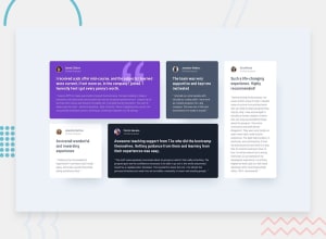
How much does it match the design? Your feedbacks will be really appreciated.
How do I go about the drop-shadow and how do I remove the horizontal scroll for the mobile view?
Community feedback
- @grace-snowPosted almost 4 years ago
Hi there
It looks like you need to do a bit more to get it closer to the original designs, namely
- use correct font as named in stylequide
- add missing bg image (quote marks) to the first card
- add missing borders to the image
- add missing drop shadow to white cards
- match padding, especially on mobile
I hope that helps, good luck with it
1@grace-snowPosted almost 4 years agoIn html you need to
- remove all the header elements. Overuse will actually cause problems for screenreaders rather than helping them
- swap all the h3s for paragraph tags. Use classes to style as needed, but that content is not appropriate to be a heading.
- place all the names inside heading elements (h2?)
1@tofydeboPosted almost 4 years agoThank you so much grace-snow for the instructive feedbacks, they opened my eyes to the errors I made. Kindly check the updated solution now and review. Thank you! Gracias!
0
Please log in to post a comment
Log in with GitHubJoin our Discord community
Join thousands of Frontend Mentor community members taking the challenges, sharing resources, helping each other, and chatting about all things front-end!
Join our Discord
