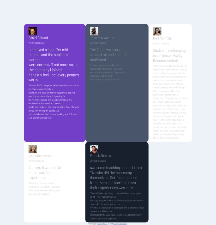
Design comparison
Solution retrospective
Any comment and tips to help align the DIV together will be much appreciated.
Community feedback
- @AryaAnish121Posted almost 4 years ago
I would recommend using flexbox instead of the grid, and in case you need help you can either comment or watch this tutorial
If this was helpful you can upvote this comment
1 - @Tink3rball3rPosted almost 4 years ago
You should give your grid container a width. Try using repeat() and auto-fit maybe minmax() as well. You could also make a grid inside the individual cards. My solution is in no way perfect but I think It could help you out.
https://github.com/Tink3rball3r/testimonials-grid-section-main-2
my preview looks pretty jacked up but the actual site is pretty good.
Happy coding!
0 - @ChamuMutezvaPosted almost 4 years ago
I would stick with Grid on this challenge as it is 2 dimensional, to use flex requires additional containers yet with Grid one container will do the task. Look for topics such as grid-area and grid-template-columns to see how you can positioning your elements
Check my solution, if that might help [https://chamumutezva.github.io/testimonials-grid-section-main/]
0@fodarePosted almost 4 years ago@ChamuMutezva . I tried the grid area option and was able arrange the divs to sit in the right columns .
0
Please log in to post a comment
Log in with GitHubJoin our Discord community
Join thousands of Frontend Mentor community members taking the challenges, sharing resources, helping each other, and chatting about all things front-end!
Join our Discord
