

Design comparison

Solution retrospective
All feedback is greatly appredciated
Community feedback
- @artimysPosted over 4 years ago
Nice Faruq, some feedback:
-
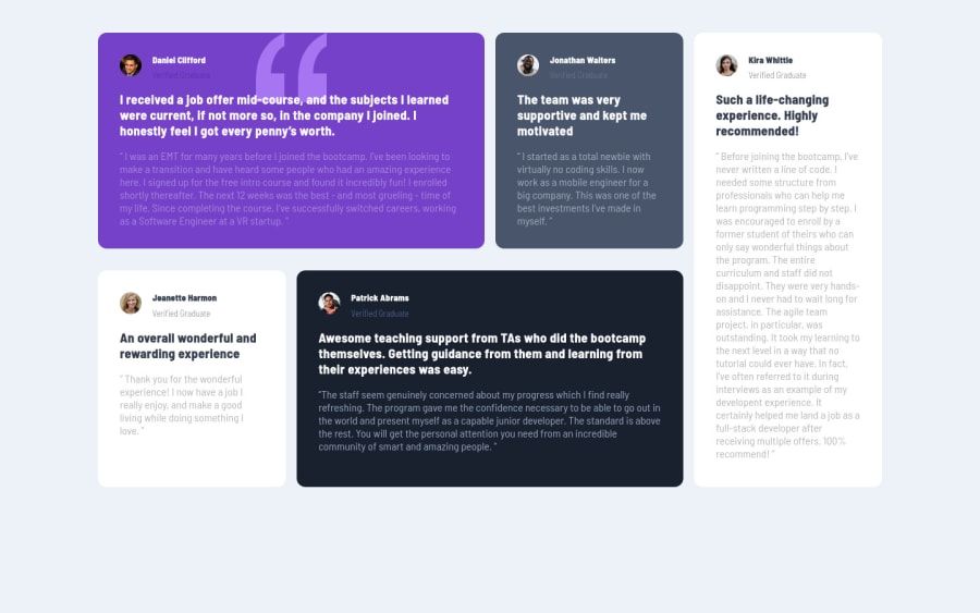
I recommend going a bit higher in width percentage for your
.testimonialsin media query 1000px. It looks like you have a bit more space to use up so the testimonials don't look too squeezed. Removewidth: 80%aswidth: 90%looks good from your 700px media query -
add the
top right 40pxvalue to yourbackgroundproperty. Adjust the 40px to your liking -
make sure to use the same font color for the 'verified graduate' text. A bit purple font on the purple card
-
add some semantics to your html. Try
<main>for your.testimonialsand<section>for your.testimonial -
apply a box-shadow
Keep on coding!! 👍👍
0 -

Please log in to post a comment
Log in with GitHubJoin our Discord community
Join thousands of Frontend Mentor community members taking the challenges, sharing resources, helping each other, and chatting about all things front-end!
Join our Discord