

Design comparison
SolutionDesign

Solution retrospective
What are you most proud of, and what would you do differently next time?
Most proud of not rewriting but reusing CSS code.
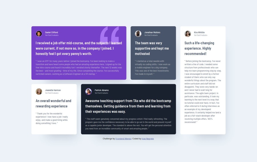
What challenges did you encounter, and how did you overcome them?Main challenge was the " graphic on the first card. I read on how to manipulate a background, position and repeat.
If possible, I would like assistance on whether or not the CSS code here is acceptable. And any tips would be much appreciated.
Community feedback
- @tOnski86Posted 5 months ago
This was a great solution!
- I just checked your code and adding the 2
backgroundproperties (one for the color and the other for the quote) was an elegant solution. Another solution would be to absolute position the quote relative to the card. - The only issue I can see here is your body width on the
1440pxviewport. Setting it around80%would probably make it better.
Other than that great work on using grids! It's nice to see you are using the concept of explicitly spanning and ordering elements using
grid-columnandgrid-row. You're on the right track here.Great job and keep going!
1 - I just checked your code and adding the 2

Please log in to post a comment
Log in with GitHubJoin our Discord community
Join thousands of Frontend Mentor community members taking the challenges, sharing resources, helping each other, and chatting about all things front-end!
Join our Discord