Design comparison
SolutionDesign
Solution retrospective
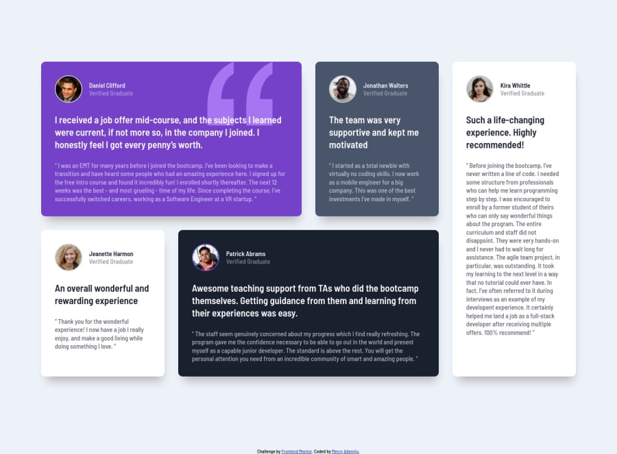
I just finished my third FEM challenge. I tried my best to make it as similar as possible. Any feedback is welcome.
Community feedback
- @ApplePieGiraffePosted about 4 years ago
Hey, luwa! 👋
You did a nice job on this challenge! The way your solution responds is good! 👍
I only suggest,
- Setting a
max-widthon the main container or wrapper so that the content of the page doesn't become too wide on extra-large screens.
Keep coding (and happy coding, too)! 😁
0@luwa-starPosted about 4 years agoThank you. I did add a max-width to the grid wrapper. I don't know why it's still so large. May be because I didn't add it to the media query min-width:1200px. I'll work on it again
0 - Setting a
Please log in to post a comment
Log in with GitHubJoin our Discord community
Join thousands of Frontend Mentor community members taking the challenges, sharing resources, helping each other, and chatting about all things front-end!
Join our Discord
