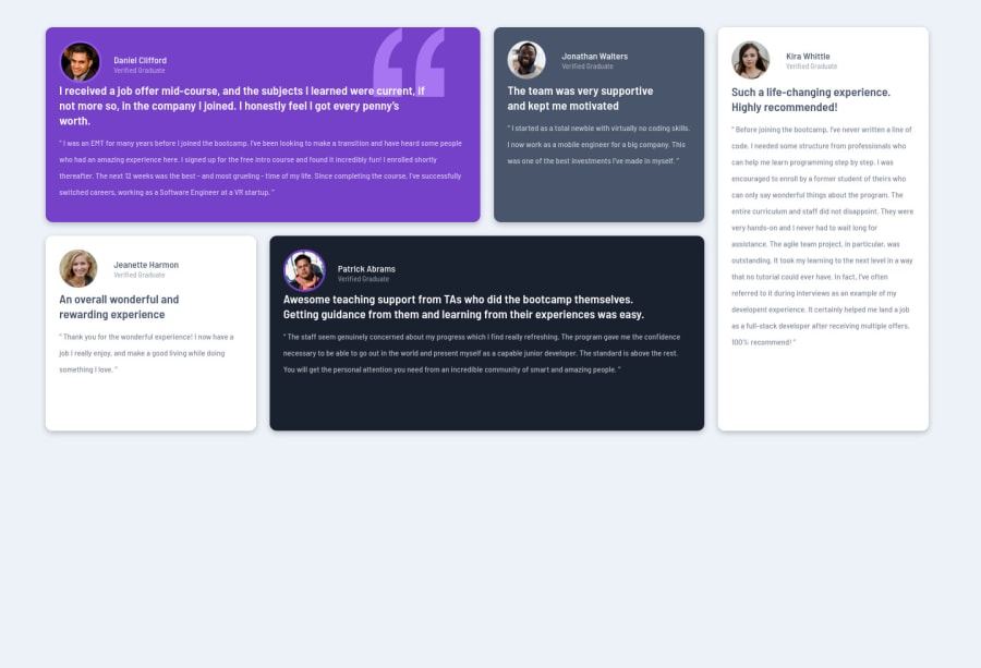
Design comparison
Solution retrospective
Hiya,
Any feeback would be welcomed specifically class spedification and responsiveness.
Thank you :)
Community feedback
- @GerbenDolPosted almost 4 years ago
Hey Chris-Ann! Great job on the layout!
There's a couple of things I'd keep in mind regarding the design:
- The font-size is a bit small in my opinion, it's a bit hard to read
- Make sure to check sizes and spacing within the cards. For example right now the profile photos are a bit too big and the margin below the photo is a bit small.
It's details like this that will get your solution from looking good to looking great!
1@GerbenDolPosted almost 4 years agoOh, and I forgot to mention: your hover transition on each card is nice, but it snaps back with no animation when you leave the card. I'd add the animation to the card both on hover and on leaving it! 😁
1@cdc2021Posted almost 4 years ago@GerbenDol Thank you so much for your feedback :)
On reflection I can see the extra details that were missing/improvment. All resolved, much appreciated!
1 - @JakubKepakPosted almost 4 years ago
Hi Chris-Ann C. ! Nice work 👏
To centre all content to the centre of a page a would set
display:flexto thebodyand then addjustify-content: centreandalign-items: centre. In order to work, you would also need to set the propertyheighton the body element. For instanceheight:100vh. Also, I would maybe setmax-widthproepty to.wrapperin order not to fill all space in wide screens.Anyway, nice job! Keep improving 🙌
1@cdc2021Posted almost 4 years ago@JakubKepak Thank you very much for your feedback, much appreciated :)
0
Please log in to post a comment
Log in with GitHubJoin our Discord community
Join thousands of Frontend Mentor community members taking the challenges, sharing resources, helping each other, and chatting about all things front-end!
Join our Discord
