Submitted about 1 year agoA solution to the Testimonials grid section challenge
Testimonial Grid Solution
@vknir

Solution retrospective
What are you most proud of, and what would you do differently next time?
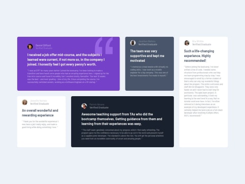
Learning grids was challenging, I was able to get the basics of it.
What specific areas of your project would you like help with?I was not able to control the behavior of quoted texts in this example. Any feedback on that would be much appreciated.
Code
Loading...
Please log in to post a comment
Log in with GitHubCommunity feedback
No feedback yet. Be the first to give feedback on vknir's solution.
Join our Discord community
Join thousands of Frontend Mentor community members taking the challenges, sharing resources, helping each other, and chatting about all things front-end!
Join our Discord