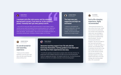
Testimonial Grid Selection

Solution retrospective
I am finding styling to be very straightforward now.
What challenges did you encounter, and how did you overcome them?Really struggled to manage this grid in an elegant way. The transition between small to large screen sizes is pretty much unhandled. Still not happy with the result.
What specific areas of your project would you like help with?-
I was expecting my grid solution to create new columns given enough space. However, this does not happen before the defined breakpoint in the media query. Why?
-
How could I approach the grid differently to have a more dynamic and responsive design? It feels a bit ham-fisted to define the grid positions so clearly. I was expecting grid-auto-flow to help me out here, but I wasn't able to get any solution to work.
Please log in to post a comment
Log in with GitHubCommunity feedback
No feedback yet. Be the first to give feedback on ComputerEnjoyer's solution.
Join our Discord community
Join thousands of Frontend Mentor community members taking the challenges, sharing resources, helping each other, and chatting about all things front-end!
Join our Discord