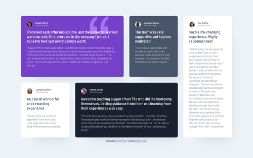
Submitted over 1 year agoA solution to the Testimonials grid section challenge
Testimonial Grid Section with HTML, CSS Grid

P
@MattJM1007
Solution retrospective
What are you most proud of, and what would you do differently next time?
Getting the formatting write with grid and applying the css reset to make adding padding and margins easier.
What challenges did you encounter, and how did you overcome them?The fonts and spacing didn't quite match up with the design file, so made some adjustments on my own to better match the design.
What specific areas of your project would you like help with?Can someone help me make this responsive? I noticed the grid was not being responsive and I could not get the media query to work with grid as well. How can I do this?
Code
Loading...
Please log in to post a comment
Log in with GitHubCommunity feedback
No feedback yet. Be the first to give feedback on Matthew's solution.
Join our Discord community
Join thousands of Frontend Mentor community members taking the challenges, sharing resources, helping each other, and chatting about all things front-end!
Join our Discord