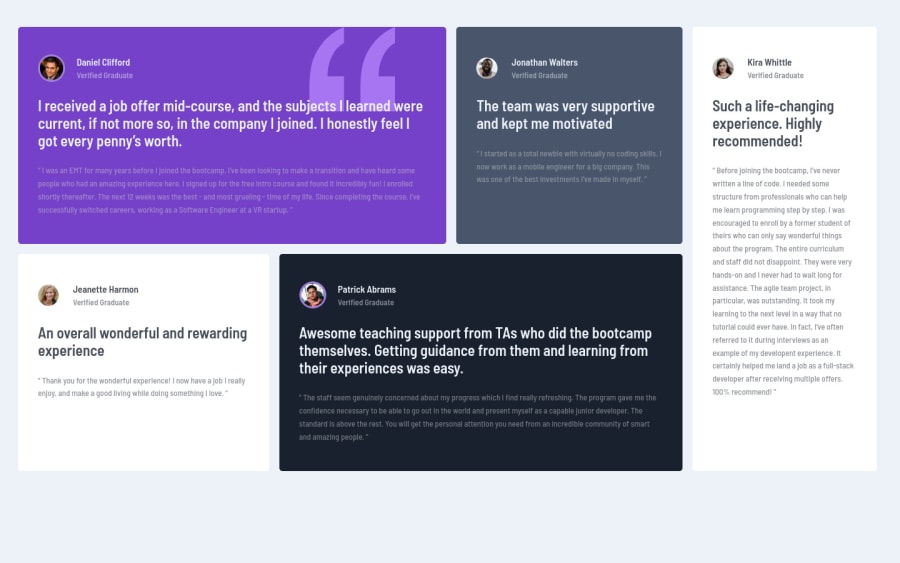
Testimonial grid section with CSS grid and SASS
Design comparison
Solution retrospective
In the mobile design I could not position the shape in the exact place, but a little approximate, if you could make it clean, I ask you to tell me how, why I could not and I applied media queries from 1024px, below that was too narrow for the layout.
Any other detail or feedback is welcome. Have a nice day <3
Community feedback
- @ApplePieGiraffePosted over 3 years ago
Hello there, Ippo! 👋
Good job on this challenge! 👏 I think your solution responds quite well and the position of the background quote in the purple testimonial card seems fine! 👍
I only suggest adding a max-width to the grid container to prevent the grid from becoming too stretched on extra-large screens. 😉
Also, vertically centering the grid container in the viewport (using flexbox or something) would be a nice touch!
Keep coding (and happy coding, too)! 😁
1@Gabrieldev-web-coderPosted over 3 years agoOmg! you comment on my solution! really thanks!
About the max-width, i must use static units?
1@ApplePieGiraffePosted over 3 years ago@ippotech
No problem! 😀
Yeah, I think fixed units (such as
pxorrem) for the max-width would work well! 👍0
Please log in to post a comment
Log in with GitHubJoin our Discord community
Join thousands of Frontend Mentor community members taking the challenges, sharing resources, helping each other, and chatting about all things front-end!
Join our Discord
