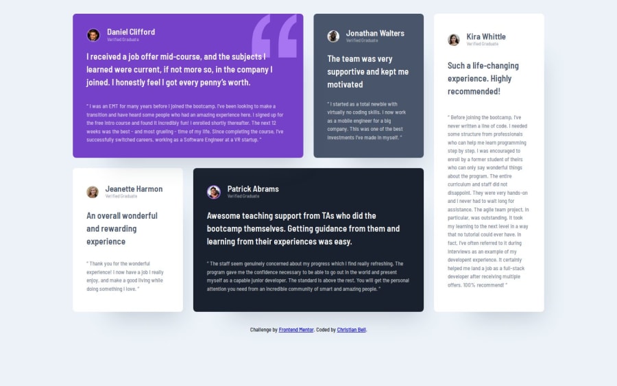
Design comparison
SolutionDesign
Solution retrospective
What are you most proud of, and what would you do differently next time?
Good CSS grid practice. I went back and forth on the semantics for this one. I ultimately set the user name as the header for each card, rather than the large pull quote but I can see how it could go either way.
What challenges did you encounter, and how did you overcome them?Positioning the items on the grid that spanned multiple rows/columns took some trial and error.
What specific areas of your project would you like help with?Interested in seeing how other people did the semantic markup
Join our Discord community
Join thousands of Frontend Mentor community members taking the challenges, sharing resources, helping each other, and chatting about all things front-end!
Join our Discord
