

Design comparison
SolutionDesign

Community feedback
- P@ComputerEnjoyerPosted 3 months ago
Very nice! Especially nice work in considering the tablet design.
Here are a few thoughts:
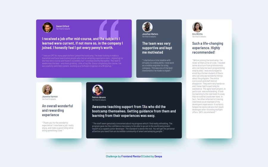
- It looks like you have two different stylings for the header section of each <article>. It is correct for Daniel Clifford, but incorrect for the rest. I believe this is because you are using a class "users" for Daniel and "person" for the rest, but only "users" is styled with a flexbox.
- The box shadow appears very turquoise. In general, the box shadow is often used as a very subtle effect to give elements a bit of depth, but it's very easy to overdo. The colors are also very tough to get just with your eye (without a design file). When in doubt, I would recommend going with #000 and then adjusting the opacity to get the right feeling.
Marked as helpful0

Please log in to post a comment
Log in with GitHubJoin our Discord community
Join thousands of Frontend Mentor community members taking the challenges, sharing resources, helping each other, and chatting about all things front-end!
Join our Discord