Submitted almost 3 years ago
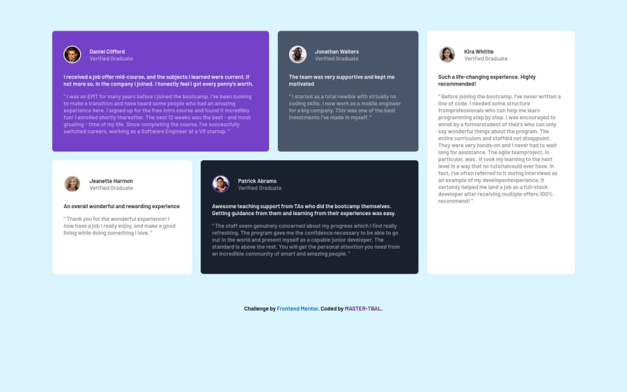
Testimonial grid section using html and css
@mastertbal
Design comparison
SolutionDesign
Solution retrospective
Please help me look at my solution and tell me ways i can improve on it. Thanks
Community feedback
- @thomashertogPosted almost 3 years ago
there are a lot of issues in the report. Please try to fix them first!
Marked as helpful1@mastertbalPosted almost 3 years ago@thomashertog Really appreciate. Thank you
0@mastertbalPosted almost 3 years ago@thomashertog Thanks very much. I really appreciate
0 - @grace-snowPosted almost 3 years ago
Hi
You need to style on classes, never on IDs
Also look up how and when to write image alt text. This is not correct at the moment (essential)
1@mastertbalPosted almost 3 years ago@grace-snow Thank you very much. I really appreciate. I'll work on them
0
Please log in to post a comment
Log in with GitHubJoin our Discord community
Join thousands of Frontend Mentor community members taking the challenges, sharing resources, helping each other, and chatting about all things front-end!
Join our Discord
