Design comparison
Solution retrospective
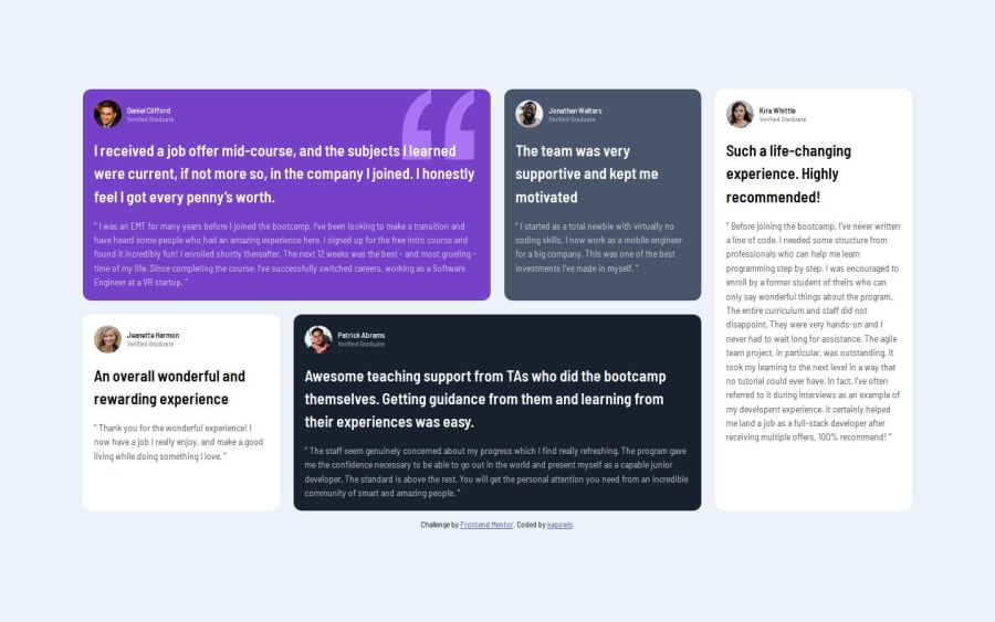
Struggled with the grid, the cards were getting stretched out and i wasn't able to position them.Until i explicitly created two rows and positioned every single card with grid-row.I know you don't have to explicitly create two rows or position every individual card to make the layout.So I clearly did something wrong and i never really figured it out .Until I messed around and noticed that the 2 cards on the first row(Daniel and Jonathan) get stretched out only until i position the fifth card(Kira).Originally i thought those cards were getting stretched out because i had forgotten to make rows or that the rows i made were too big or something.But no, once the fifth cards gets placed correctly with grid-row-start and grid-row-end the other two cards(daniel and jonathan) stop stretching.
I also found out that even if you don't create rows you can still position the card on a row.However if I dont explicitly create the rows, it seems i have to set the kira card like this
.card.grid-item-5{
 grid-column: 4 / 5;

  grid-row: 1 /3;  /*  instead of grid-row: 1/-1;   */

*/
}
when I do grid-row-end on -1 the fifth card doesn't reach the last row and the other two cards of that row end up getting stretched out.
Another issue is the same old one and i cant really seem to wrap my head around it.Sometimes my container doesn't take up the full web page even when i set my container to min-height:100% .What i mean is on large desktop the container does not fill up the web page. But as soon as I inspect the page or on smaller device the container fills up the viewport. I've been relying on .container{min-height:100vh;} and that does fix this issue but i'm not sure i truly understand how all of this is working.
Community feedback
- @JuanTwoFourPosted 6 months ago
Good solution to this, the page is doing what it is meant to do and your code is clean. As for the trouble on the graph aspect of the project, I highly suggest checking Kevin Powell out on youtube, he has been amazing help to me throughout my learning experience. Also he does his grid tutorial video based off of this project, it is very easy to understand and it's a good way to compare code to see where you can improve.
Marked as helpful0
Please log in to post a comment
Log in with GitHubJoin our Discord community
Join thousands of Frontend Mentor community members taking the challenges, sharing resources, helping each other, and chatting about all things front-end!
Join our Discord
