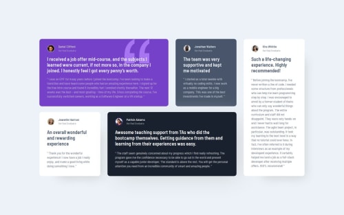
Testimonial Grid Section project

Solution retrospective
I’m most proud of experimenting with the grid system. For next time, I’d aim to better handle font colors and other design details. Additionally, I might consider using Tailwind for more consistent and reusable styling.
What challenges did you encounter, and how did you overcome them?I faced challenges with font colors and their accessibility. It was difficult to ensure the colors met the right choices of the project. To overcome this, I proceeded with the project details while acknowledging the potential issue. Another challenge was deciding between coding CSS for each card separately or creating my own CSS system for reusable styles. I chose to create my own system for its efficiency in handling the specific details of each card.
What specific areas of your project would you like help with?Disclaimer: I didn't use blockquote because, by definition, it defines a section that is quoted from another source. I don't think it is the case here (correct me if I'm wrong, and I'll change it right away).
Any advice on improving would be valuable. Thank you so much for your time and effort in evaluating this.
Edit: Big thanks to @Fbeye04 for the nice little touch on the card hover:
testimonial {
    transition: transform .3s ease-out;
}

.testimonial:hover {
    transform: translateY(-5px);
}
Please log in to post a comment
Log in with GitHubCommunity feedback
No feedback yet. Be the first to give feedback on Flávio César's solution.
Join our Discord community
Join thousands of Frontend Mentor community members taking the challenges, sharing resources, helping each other, and chatting about all things front-end!
Join our Discord