Design comparison
Solution retrospective
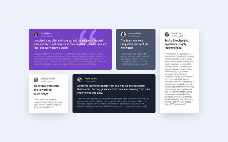
I'm most proud of the clean and visually appealing design of the testimonial grid. The layout and styling came together well, and it effectively showcases the testimonials.
Next time, I would focus more on making the grid fully responsive. While it looks great on larger screens, I realize that it could be improved for smaller devices. Additionally, I would aim to add more interaction features to make the grid more engaging for users
What challenges did you encounter, and how did you overcome them?One of the main challenges was making the grid responsive and ensuring it looks good on various screen sizes. It took some trial and error to achieve the desired responsiveness while maintaining the visual integrity of the grid.
I overcame this challenge by utilizing media queries and flexible layout techniques in CSS to adapt the grid to different screen sizes. I also tested the grid extensively on different devices to ensure it displayed properly.
What specific areas of your project would you like help with?I would appreciate feedback on the responsiveness of the testimonial grid, especially on smaller screens. Additionally, suggestions for enhancing user interaction within the grid would be valuable. Thank you for your input!
Community feedback
Please log in to post a comment
Log in with GitHubJoin our Discord community
Join thousands of Frontend Mentor community members taking the challenges, sharing resources, helping each other, and chatting about all things front-end!
Join our Discord
