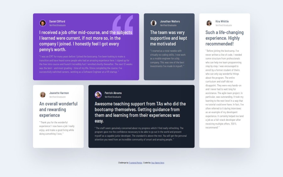
Design comparison
Solution retrospective
I was able to complete this challenge and implement the grid layout.
What challenges did you encounter, and how did you overcome them?I had difficulty understanding the implementation of the grid layout system, but I was able to figure it out.
What specific areas of your project would you like help with?Currently any help on the best practices in responsive web design will help.
Community feedback
- @SergioCasCebPosted 5 months ago
Hey there, really good job with the challenge specially if you are not used to utilizing Grid.
I might have a few tips for you to consider for future projects:
- In your container you are giving it a
widthof 80%, I would recommend you give a max-width of any value you seem fit, and the padding that you want to use. This will give your content a better chance to stretch and look better as you make the screen smaller. As you can see in your current code in the screen sizes of 960 and 1300 you content starts getting a bit too squished. - Also maybe consider utilizing one more media query breakpoint for medium size screens.
The most common breakpoints tend to be
768px(medium) and1080px(large).
Marked as helpful1@larryQuaoPosted 5 months agoSure @SergioCasCeb, Thanks for the tip, I will get right on it.
0 - In your container you are giving it a
Please log in to post a comment
Log in with GitHubJoin our Discord community
Join thousands of Frontend Mentor community members taking the challenges, sharing resources, helping each other, and chatting about all things front-end!
Join our Discord
