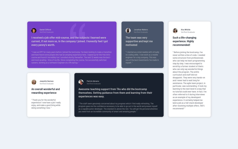
Design comparison
Solution retrospective
I wasnt able to fixed the quotation marks to its parent element and push it behind the p element. i tried using margin but it makes the div contents it is not responsive. i settles with margin. 4hrs of hw same thing. chrome and firefox windows zoom is different with my design being perfect in firefox and bad in chrome.!
Community feedback
- @correlucasPosted over 2 years ago
👾Hello Hafsat Nasidi, congratulations for your new solution!
I've opened your solution in Google Chrome and is working fine. I did also some changes to the quote position and removed some unnecessary properties.
.quotes-pic {
    /* width: 90px; */
    /* height: 90px; */
    z-index: 0;
    margin-left: 214px;
    opacity: 0.3;
}
The rest of your design is just perfect. Maybe you can improve a bit only the semantis, here's my tips for you about semantic, just replace the div holding all content with
<main>, give<div>that wraps each card with<article>and the paragraph with the quote with the property tag<blockquote>this way you'll wrap each block of element with the best tag in this situation. Pay attention that<div>is only a block element without meaning.👨💻 Here's my solution for this challenge if you wants to see how I build it: https://www.frontendmentor.io/solutions/testimonials-grid-section-vanilla-css-focus-effect-custom-design-e5bIzU3vZN
👋 I hope this helps you and happy coding!
Marked as helpful1@hafsatun2020Posted over 2 years ago@correlucas thank you very much! I love your design and would try ur solution as u recommended.
0
Please log in to post a comment
Log in with GitHubJoin our Discord community
Join thousands of Frontend Mentor community members taking the challenges, sharing resources, helping each other, and chatting about all things front-end!
Join our Discord
