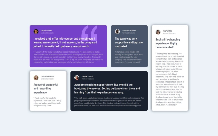
Design comparison
SolutionDesign
Solution retrospective
What are you most proud of, and what would you do differently next time?
Due to previous projects my mind was very clear on approaching this design
What challenges did you encounter, and how did you overcome them?Adjusting the line break and what is the min and max width that the design is demanding without the figma files was a challenge,.
What specific areas of your project would you like help with?I will be grateful for any tips or pointers. :D
Community feedback
Please log in to post a comment
Log in with GitHubJoin our Discord community
Join thousands of Frontend Mentor community members taking the challenges, sharing resources, helping each other, and chatting about all things front-end!
Join our Discord
